for Storing and Transporting Paintings

[I decided to quit bellyaching about anomie & the state of the world and contribute something from my vast fund of experience designing things, in this case packaging. My inspiration came from the incredibly informative blogs I've been reading, among them,
Joanne Mattera,
Carol Diehl and
Molly Stevens. ]
:::
For several decades, I struggled with the logistics of storing and transporting my paintings. I have had mixed success and occasionally have ruined a piece due to clumsiness or ignorance. I have gone nuts trying to accommodate a fruitless & exhausting round of exhibitions at non-profits, juried shows and self-promoted events. Things would get ding-ed and scratched. Curators, photographers, framers and installers (often this was me) did not always take necessary precautions. But worse, after I had stored the stuff, often improperly due to lack of space, funds or experience, I would take it out only to discover the harm done by using wrong methods and materials.
If I were a "blue-chip" artist, I would most likely turn the problem over to professional art handlers who would package everything according to the latest and best practices and store it all in a climate-controlled warehouse, for a nice fee. And I would probably be able to afford to insure my work, as well. But I am not and probably never will be, so I continue to seek better solutions that I can implement myself.
There was a time when I wrapped everything in large sheets of poly, leaned them up against a wall or partition with cardboard dividers and called it a day. This actually works quite well, but there can be problems:
• Corrugated cardboard, as useful as it is, can leave abrasions on painted, gilded and varnished surfaces. If the abrasions were random and scattered, they might have some charm and be considered the patina of age, however, there is no way to disguise the regular stripey pattern which the corrugations impart.

• Little paintings can press into the stretched area of big ones leaving marks and depressions. It is never advisable to lean
anything against the stretched area of the canvas as it can be torn, or dented. Small dents may respond to judicious, localized spraying with a mist of plain water on the reverse in an attempt to retighten the spot, but it is better not to create the dent in the first place. It stresses the paint film in ways that may show up in the not-so-distant future.
• In high heat and humidity (such as we have here in New York summers), plastic may trap moisture; it can also adhere to a paint film that is still a little soft. Some oils take many months to dry completely.
• And, in the not-improbable event that you will have to take work out of the studio for photography or to show an interested party, you will be faced with a lot of cumbersome unwrapping and re-wrapping, sometimes necessitating the purchase of new plastic.
I have designed a 2-piece, lidded corrugated carton that solves these problems.
Click on the illustrations to make them larger and clearer.

This design is essentially a bottom panel with fold-up sides, which attaches to the back of the stretcher bars using two screws (or as few as possible; more may be necessary depending on size) and a snug-fitting lid with glued corners.


The depth is a function of the thickness of the canvas plus some adequate amount of airspace/stand-off (again, depending on overall size). Nothing touches the surface of the painting. It is protected by a double layer of cardboard all around its edges and the lid stands off due to the depth of the sidewalls.
Benefits of this design include:
• The painting is completely enclosed without anything touching its surface. It is easy to pick up and carry around, stack vertically or horizontally, toss into a car etc. without worrying about harm.
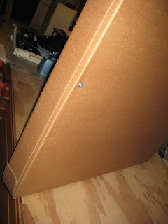
• Opening the carton is as simple as lifting off the lid. The sides of the bottom panel, because they are just flaps folded up, can be easily folded back for the purpose of photography, without actually dismantling the carton.

• It is lightweight and takes up only a little more space than the work itself.
• It makes a very tidy presentation when you bring it around to the gallery; it makes a very convenient package for your photographer who will be grateful not to have to handle the delicate object itself.
My paintings, these days, are generally what I consider medium-sized. They range from about 30" x 30" to 40" x 60". I use 1-1/2" thick stretcher bars. I paint, somewhat traditionally, in oil on canvas. The surface is thin and delicate, easily scratched and abraded, so careful handling is paramount. I often work in series all of the same dimension or with one common dimension, e.g. 30" x 30" and 30" x 32". However, this carton design can be made for any stretched canvas painting under 42" x 90"; it is easy to adapt.

A group of paintings with a common dimension can be stacked and/or carried more easily than one in which the edges do not line up. While I would never recommend sacrificing aesthetic imperative for the sake of logistics, working all in the same size also presents advantageous economies of scale in terms of time and materials, chief among which are: 1) you only have to design/measure the carton once, and 2) you can minimize the waste of material by bulk purchasing sheets of corrugated in the size you need, and 3) you can pre-make cartons and hold them in reserve for later.
MATERIALS
(for each carton):
• 2-sheets of clean, uncreased corrugated cardboard approximately 6" larger than the painting in each direction.
(see below)
• 2 or more
short, self-tapping, washer-head screws (#8 x 1/2").

The screw length will depend on the thickness of your stretchers; BE ABSOLUTELY SURE that they are not so long that they could go all the way through the stretcher. If you can't find the kind of
screw shown here, you can use a plain wood screw with a separate washer. The washer provides a wide surface to prevent the screw head from tearing through the cardboard.
• Ordinary (Elmer's-type) White Glue
TOOLS
you will need:
• A tape measure
• A good, long straightedge for marking, scoring and cutting
• A T-square or triangle to create squared-up lines
• A utility knife with fresh blades
• Something to score the fold-lines, e.g. a bone folder, a screen repair roller, or even a dull butter knife.


• A 1/4"
hollow steel punch (& hammer) for cutting out the corners (not absolutely necessary, but it makes a neat corner and relieves some of the bulk at the fold)

• A drill or awl to make starter holes for the screws
• Screwdriver
• Something to clamp the glued corners with; I use a book press, but a concrete block or litho stone or other square weight could do the job. You might also try C-clamps. With a book press, I can only do one corner at a time, but the pressure is so effective with white glue, that it only takes 30 seconds to get a good bond; then I shift to the next corner and work my way around in this fashion.

METHOD:
Bottom of carton
1) Measure your painting's height & width. Add 3/16" to each of these dimensions. (It helps to jot down these numbers on a small sketch). Following the schematic for the
BOTTOM, mark out these dimensions on the cardboard, making sure your drawing is nice & square. Measure and mark the side flaps (they should be the thickness of your canvas plus an inch more or less).

2) If you have a punch, punch out the corners as shown before cutting out the outline. You will be removing a square of material from each of the 4 corners.

3) Using the straightedge, score the fold lines. Scoring
with the grain may result in some tearing, go gently, but don't freak out. Scoring
across the grain is much easier.
4) Fold up the side flaps and set the painting inside. Be sure it fits well.

5) From the backside of the carton bottom, make pilot holes and insert the screws on opposite sides of the piece. PROCEED WITH CAUTION. DO NOT penetrate the stretcher bars more than is necessary. I find that 2 screws are adequate to hold a 30" x 30" canvas. I would add more for larger work. Use your own best judgement.
Lid of Carton
6) Measure the height & width of the bottom you just made (with the sides folded up). Add 3/16" to each of
these dimensions. Following the schematic for the
LID, mark out these dimensions on the other sheet of cardboard. Measure and mark the side flaps (they should be the same as the side flaps for the bottom or slightly deeper).

7) If you have a punch, punch out the corners as shown before cutting out the outline. You will be removing a thin strip of material from each of the 4 corners (see schematic).

8) Using the straightedge, score the fold lines.
9) Fold up the side flaps, and fold over the corner glue flaps. Glue each corner and clamp it until the glue has set. Let it dry to assure a good bond. The lid should fit snugly over the bottom.

If you are having trouble with this design, the problem is either in the measuring or you've got the thing out of square. Aim for accuracy. You may have to tweak things a bit to get the fit you want, as I did when I was developing it. But I hope you will get satisfactory results after one or two tries.
This carton was designed primarily for storage and for personally transporting work. I would not trust it as a shipping carton on any of the usual common carriers without providing a doublewall outer carton (yet another project).
Return to materials list
A few words about corrugated cardboard. Seemingly ubiquitous, this stuff is notoriously hard to get a hold of when you need it. We are not talking about raiding the liquor store recycle on moving day, or scouring the neighborhood for discarded refrigerator cartons. Purchasing large sheets (full size is 4' x 8', smaller stock cuts are available) isn't as easy as it seems.
Corrugated is remarkable material comprising a fluted inner "medium"—which is just a layer of paper specially scrunched up on a corrugator—to which are glued an outer and an inner "liner". It is shock-absorbent, strong, insulating, and myriad other beneficial properties. It is most often seen in plain brown kraft. Often the outer liner is of a slightly higher "basis weight" providing a tougher outer surface which, not only adds strength to the skin, but also, masks the stripey ridges of the fluted medium, giving a smoother surface for printing (I sometimes place the "out" side of the pad against sensitive materials to lessen the risk of abrasion.) The paper used in making ordinary corrugated is NOT acid-free, but for this application that is hardly necessary. Archival packaging materials are quite costly and are especially important when dealing with works on paper, but that is also a topic for another post.
Most corrugated cardboard is manufactured for a specific wholesale customer's order, although there are many retailers of packaging materials (e.g.
Uline) who provide a limited assortment of plain sheets (or pads, as they are often called).
There are several standard thicknesses of board. The thickness is partly a function of the spacing of the flutes.

Above is a comparison chart with a rough approximation
(the idea for this chart originally came from an excellent packaging design manual, which name I have long forgotten; if anyone recognizes it, please let me know. I'd love to get another copy. ) For a thorough but concise description of the various weights and thicknesses, go
here. As an example, E-flute and F-flute (not shown) are very thin & fine (think cosmetic packaging), C-flute is pretty standard for general purpose cartons. B & C can be laminated into a "doublewall" for extra strength shipping cartons for heavy or fragile items.
As a "general public" retail consumer, you will not have a lot of choice about the materials offered. But it is good to be aware that corrugated cardboard is rated by two different standards: ECT (Edge Crush Test, usually a 2-digit number, like 32) and Burst Strength (usually a 3-digit number, like 275#) representing pounds of pressure.

 Here
Here is an unusually well-written and intelligent discussion about the differences. Most likely, you will be buying off-the-shelf, single-weight 200# C-flute. Heavier weights and thicknesses are available, if you look, but a custom specification requires an enormous minimum order, well beyond the means of the average solo artist.
Your biggest cost may, in fact, be the shipping. So buy local, if you can. A pick-up truck is a big help here. Small sheets are UPS-able; check the charts. Large sheets
have to go by truck. The shipping costs may have to be ferreted out of the supplier; they vary by carrier. The freight companies
do not like to ship to residential addresses, so if you have connections with a facility that has a loading dock and some storage space, try to arrange to have it shipped there (think: school, small local factory where you know somebody, industrial building next door). A single large sheet is quite fragile, but if you buy in bundles (as it is usually offered) the bulk protects the individual sheets. Get together with other artists and place a big order if you want to save money. When it gets delivered, don't freak out if the corners are mushed. Just be sure you buy sheets big enough to cut off the bad edges. However, you will need space to store this stuff. Flat is best but, if it is snugly strapped together, you can store it vertically. Basements are not good unless you have the dampness factor under control (at the very least, raise the sheets up on a pallet or some crosswise 2x4s.) And another thing: do the math and figure out exactly how much space it will occupy. For example, C-flute measures 3/16" thickness, so if you buy 25 sheets, you're talking (.1875 x 25 =) a little over 4-1/2". If these sheets are 48" x 96", you're going to need a chunk of space. If you already have a shop where you store sheet stock, great. You can lean it up with the plywood and it will stay unbent.
There used to be a place on 6th Ave around 22nd Street called Wolf Paper & Twine. They had a great assortment of packaging supplies right out on the street, the loading dock was always open and you could just walk in there and walk out with just about anything. It was possible to buy a single sheet if that's all you wanted, and, it being Manhattan, you could walk the thing home. This sort of neighborhood business is really a thing of the past. If anyone knows a supplier like that, please share. I sometimes order from
Cornell Box in Brooklyn. There are converters (companies which manufacture cartons) in Newark who will sometimes let me have a few sheets for prototyping, if they think it will result in a big box order. It’s never a good idea to harass your suppliers for favors without offering something in return. But, I am no longer in the business of package design, so my contacts have fallen away. I have to buy my supplies from the retailers just like everybody else.
This carton design is the result of years of trial & error. It works really well for me as I hope it will for you. I like that is simple, elegant and minimal and allows for easy access to the work. Please let me know if my instructions are unclear or if you need further information.


 Posts
Posts


